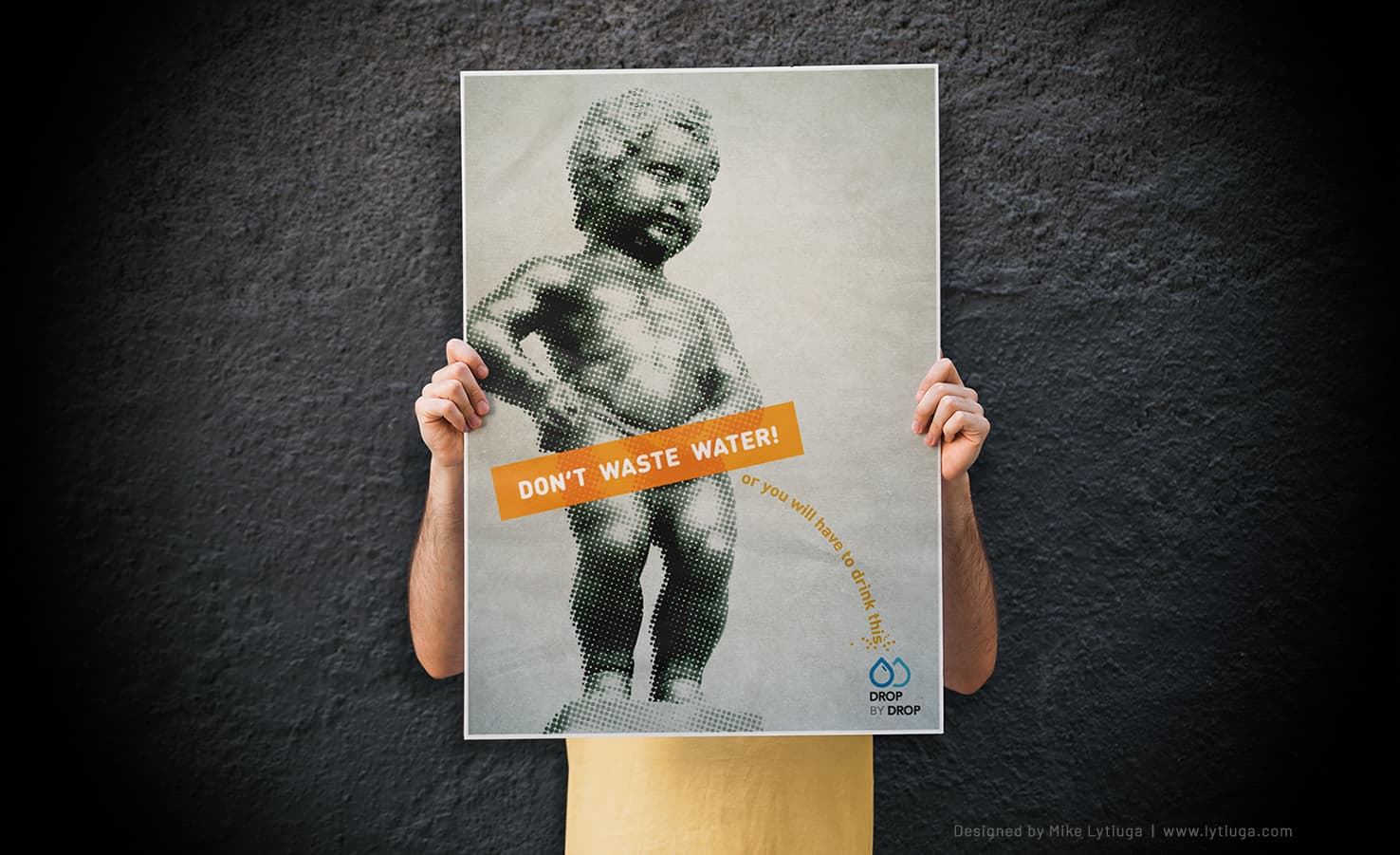
Don’t waste water poster design.
CLIENT:
“Drop by Drop” international Environmental Initiative.
MARKETING OBJECTIVES:
Poster design on the importance of water conservation for the International Poster Design Contest.
INDUSTRY:
Social Initiatives, Ecology
THE PROBLEM
In any developed country, clean tap water is something that is taken for granted, constant, and therefore not noticed and arbitrarily wasted.
Just open the faucet! It’s so simple and so familiar that many people don’t see how much clean water is wasted.
THE SOLUTION:
To turn the utterly ordinary into something that demands attention, the focus of human perception has to shift dramatically. It must be a completely different visual metaphor, sharp, not instructive, and not dull.
That’s why I selected a conception that shows the importance of the problem and makes this issue personal.
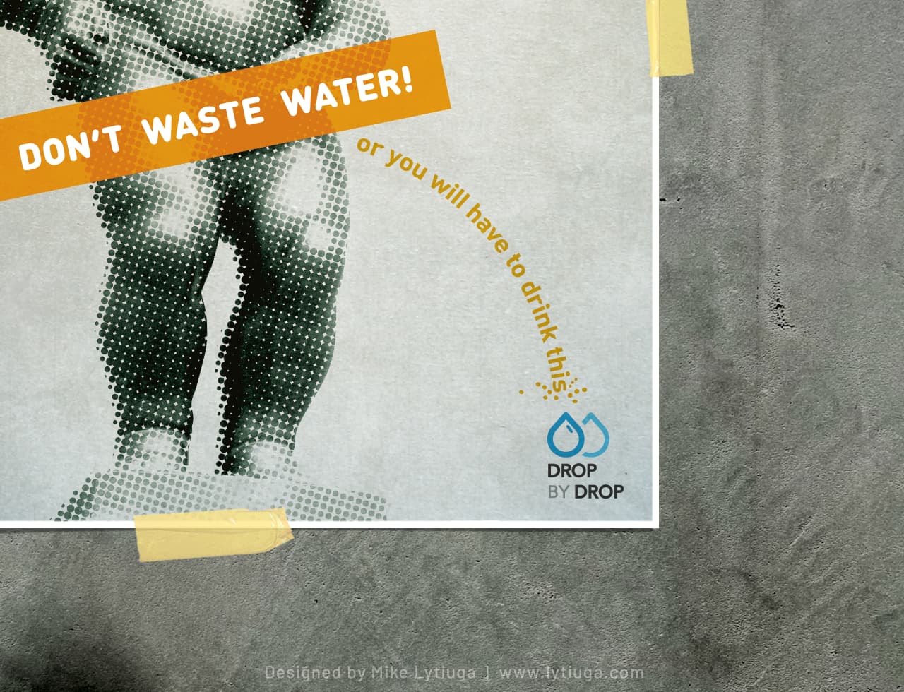
A perfect combination of body text and logo
The viewer’s eye follows the text and crashes into the campaign logo, reinforcing the main message
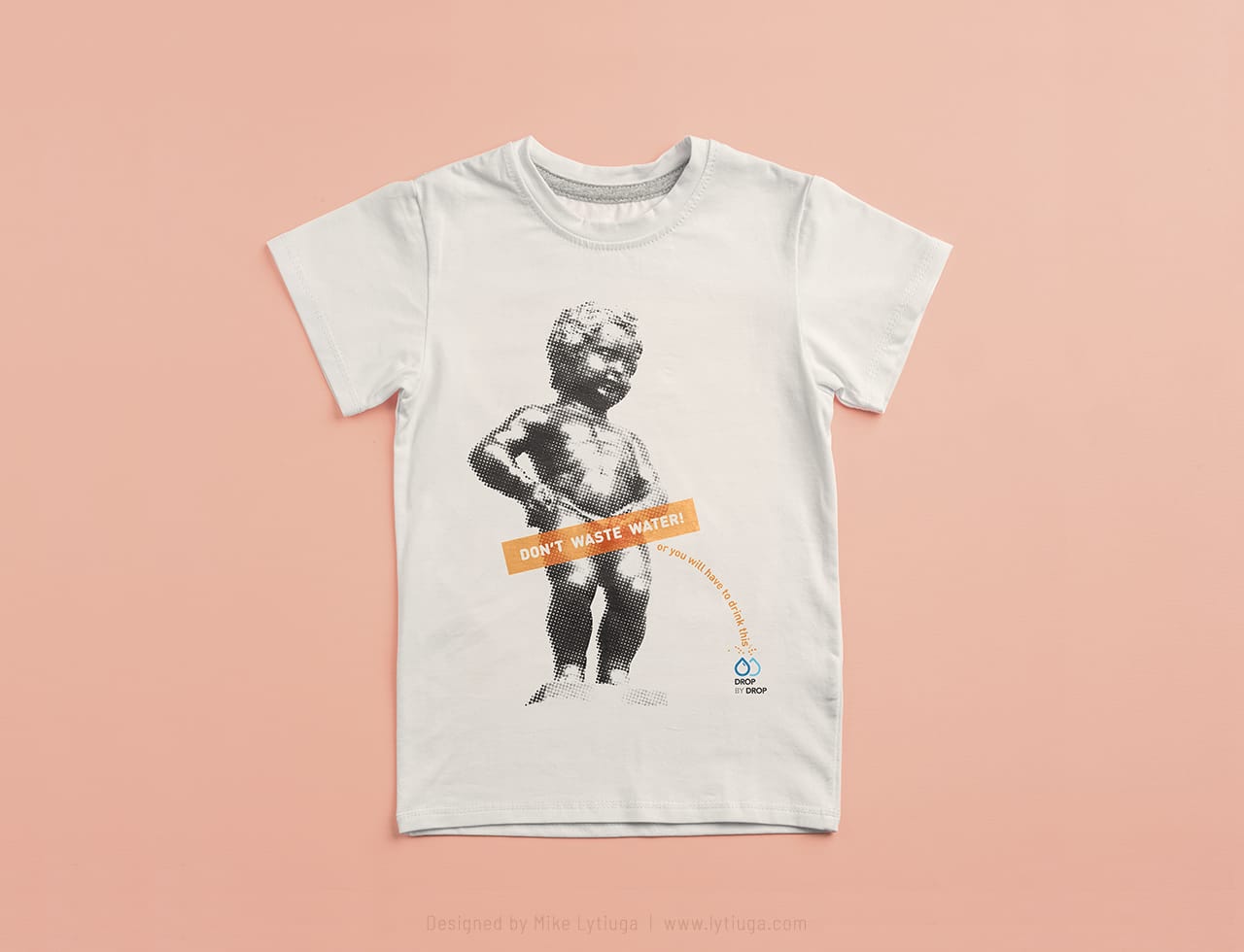
SOME BRANDED MERCH
In this case, a plain white T-shirt with full-color art printed by DTG is a great media to spread the idea to the masses. Not for sale in Belgium 🙂

CREATIVE TEAM
Art director& poster designer: Mike Lytiuga
PS. That’s not me in this picture.
Did you like this poster?
Do you need a poster design for your business, event, ideas, or beliefs? I can help with that; just use this contact form to drop me a message.

