LOGO DESIGN STRATEGY
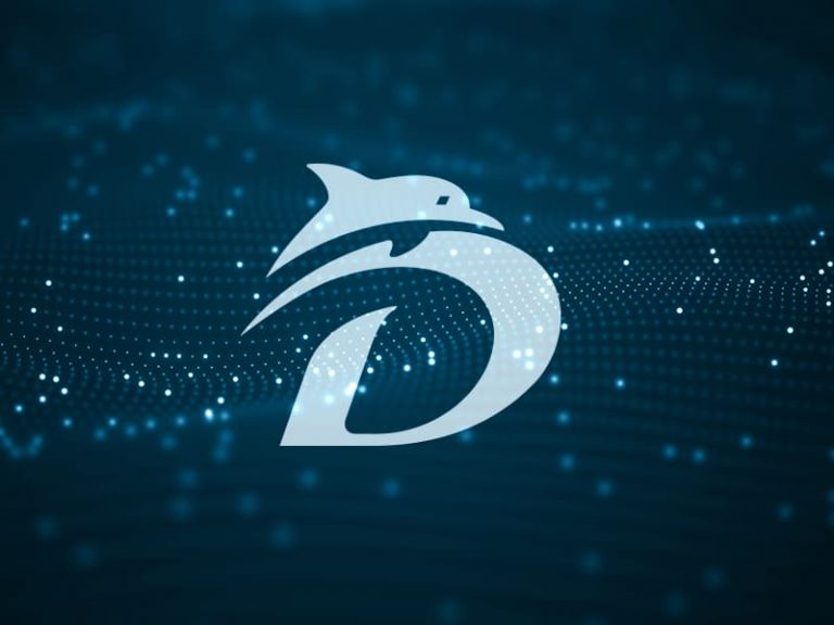
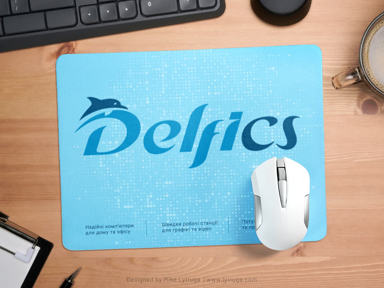
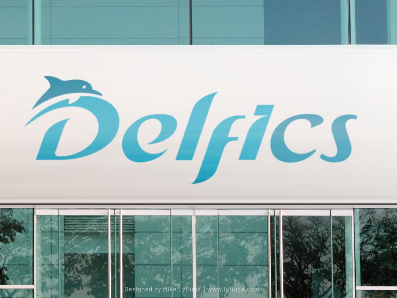
You could ask, “Why use the dolphin in the computer logo?.” First, the central part of the brand phoneme sounds like “dolphin” in Ukrainian. Second, the dolphin is an intelligent and fast creature — a perfect visual metaphor for the computers this brand makes. And finally, third – the client wants this.
I created custom lettering with bold and rapid looks to make the logo more dynamic and distinctive from other local trademarks made with typical tech-facing fonts. Two turquoise tones finalized the logotype look.
LOGO DESIGN: PRIMARY BRAND COLORS
A two-color version of the logo is designed for primary communication channels such as print and outdoor advertising, packaging, branded merchandise, and branded apparel for sales representatives and consultants.
LOGO ICON
The company boss liked the sharp image of a dolphin so much that it was made into a separate branding unit for use on the nameplates of computer cases, on quality control stickers, and even on limited-edition branded cufflinks.
The cheaper print method doesn’t mean a cheap look.
Such color options are used for branding computer cases and shipping boxes. As you can see – even printed with one color, the logo retains excellent recognizability and legibility.
Primary brand colors
The color pair of dark-light – works great on any promotional products, allowing a spectacular and inexpensive branding of anything.
And even more – in various Internet media specialized in covering the local computer industry, this color pair is used for coloring the phoneme of the DelfiCS brand like this.
CREATIVE TEAM
Art director, lettering artist and logo designer: Mike Lytiuga
DID YOU LIKE THIS LOGOTYPE?
Do you have any questions about your existing logo? Does your business need a new smart logo design or redesign of the old one?
Just drop me a message by filling out the form below, and I will help you.

