LOGO DESIGN STRATEGY
First, the client has a great brand name, which is a rarity in Montana. Playing and sketching around this brand name, I’ve found a pretty neat visual idea, the astronaut with the mop.
Pistachio, the primary brand color, perfectly corresponds with the main company mission, “to provide eco-friendly and healthy house cleaning.” The secondary brand color black is perfect for creating various text accents.
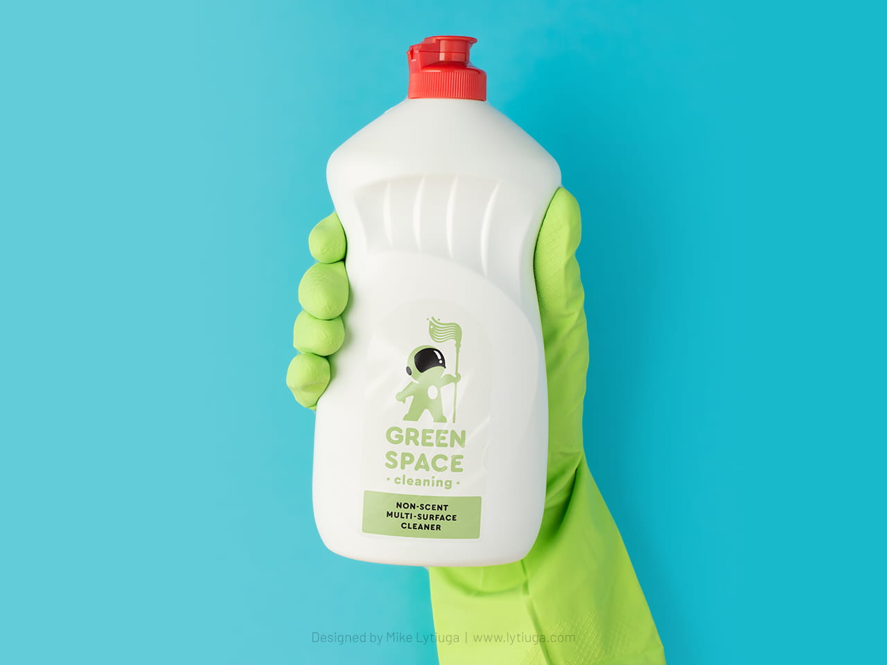
Logo Design: vertical option
For better branding, the logo has two vertical and horizontal versions available in two colors and monochrome versions.
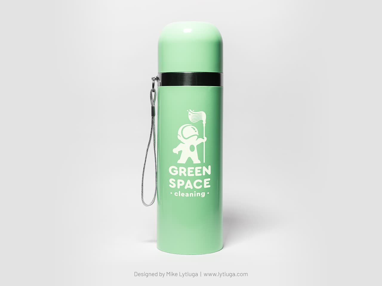
The vertical logo is used for branding items with a strict vertical dominance – bottles, containers for the company’s own line of detergents, etc.
AND NOW IN ONE COLOR!
The same vertical logo option but created for one-color applications, like laser engraving, hot foil stamping, etc.
As you can see, the shapes are slightly different from the original two-color logo option, emphasizing details like the helmet’s visor and headphones.
HORIZONTAL LOGO
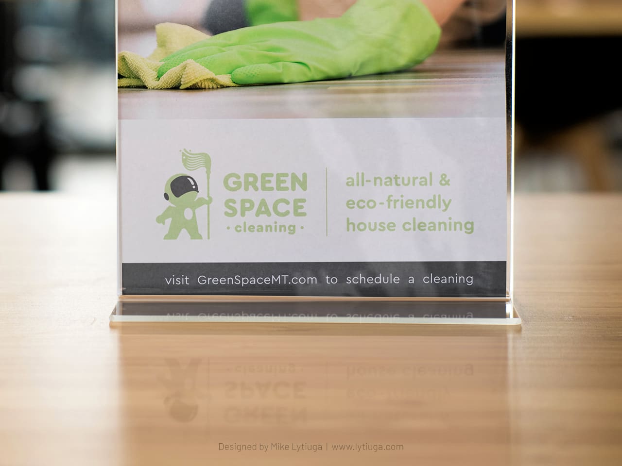
This option is mainly used for various marketing collaterals and left chest branding apparel.
This neatly designed option is perfectly integrated with different branded messages, such as on this table tent.
THE LOGO ICON: I can speak!
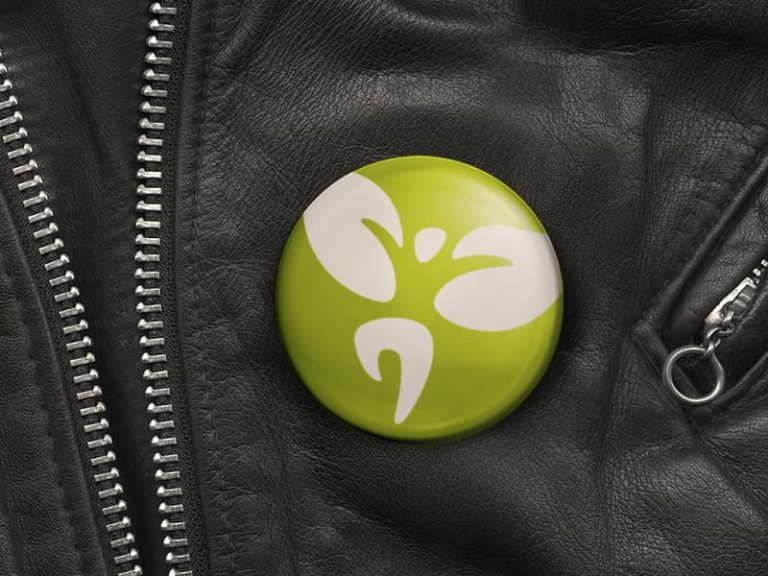
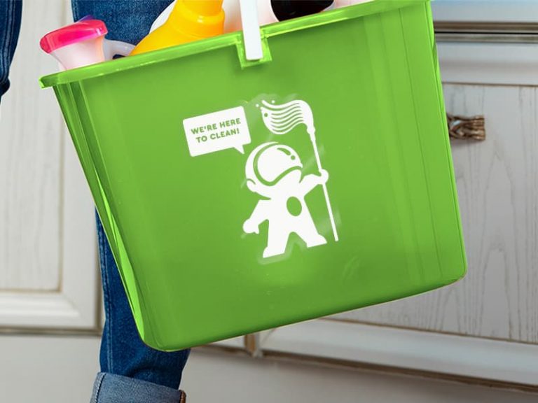
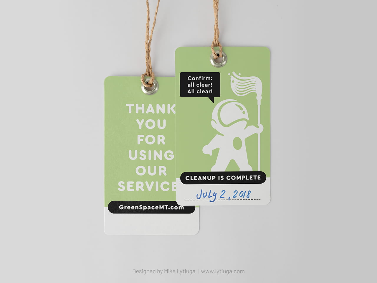
This logo icon is mainly used for small branded items, like stickers for marking company appliances or thank you tags.
This little black communication balloon makes the logo icon even more alive, allowing me to play around with different meanings, mixing business and pop culture.
“This is major Tom. I’m here to clean” – if you know what this means.
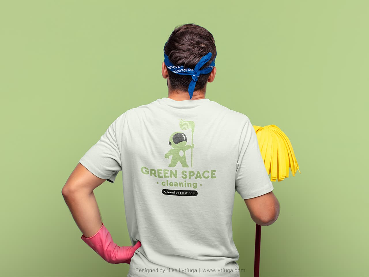
Why not work wearing branded cloth?
This is a secondary logo option – for use on the t-shirt back and merchandise gifts such as tote bags.
CREATIVE TEAM
Art director, logo designer: Mike Lytiuga
DID YOU LIKE THIS BRANDING?
Does your business need a new cool-looking logo design or a redesign of the old one?
Drop me a message by filling out the form below, and I will help you.

