LOGO DESIGN STRATEGY
This logo is a stylized image of a real pioneer, a man with a huge backpack and road stick, a real tramp who knows the trail’s call.
The primary color scheme for this brand is the colors of mud, sand, and leather.
PRIMARY LOGO OPTION
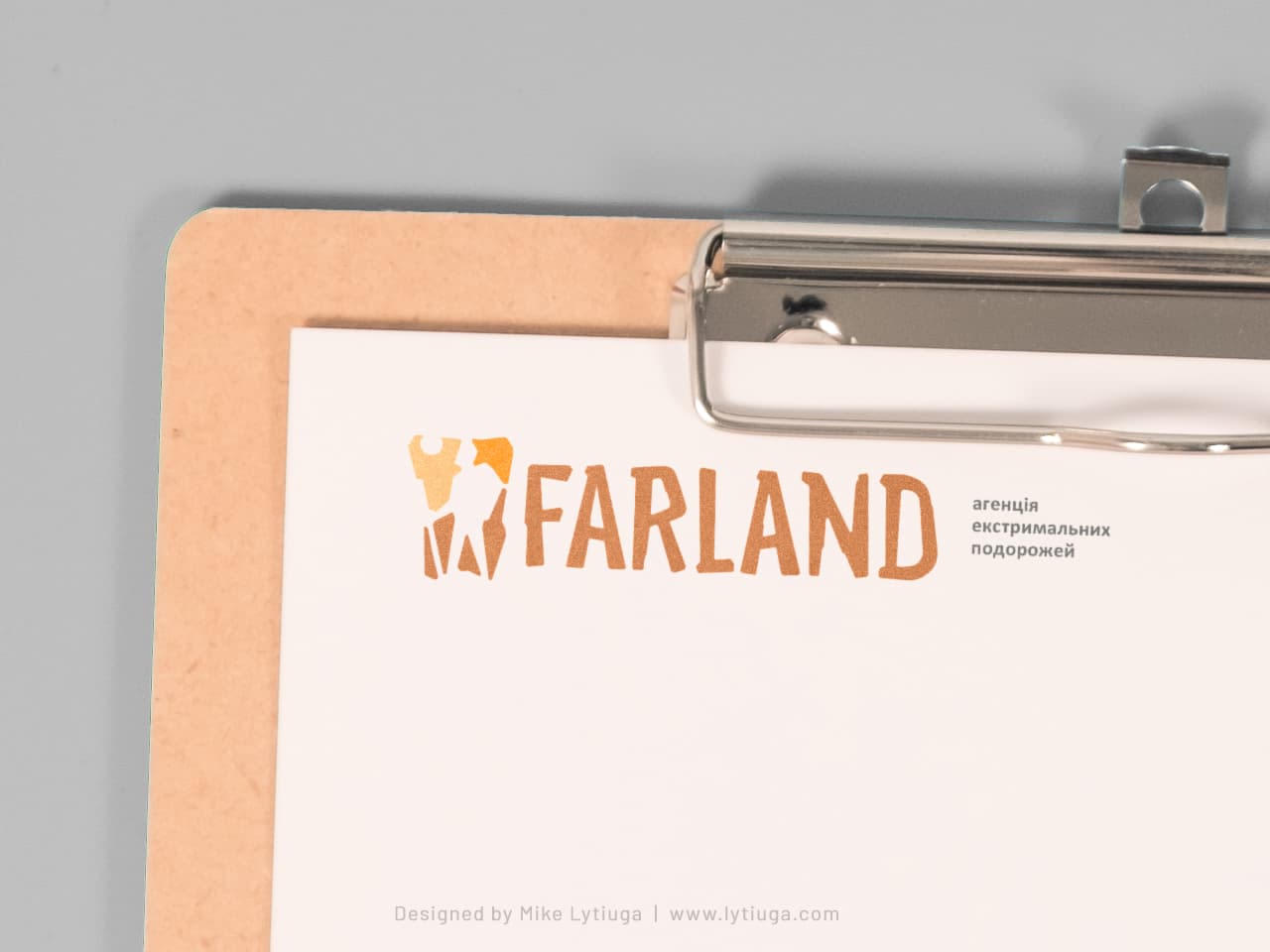
This primary logo is used for major communication channels, like printed media, corporate stationery, web, and application design. Here is the logo with the byline as it is shown on letterhead.
LOGO ICON
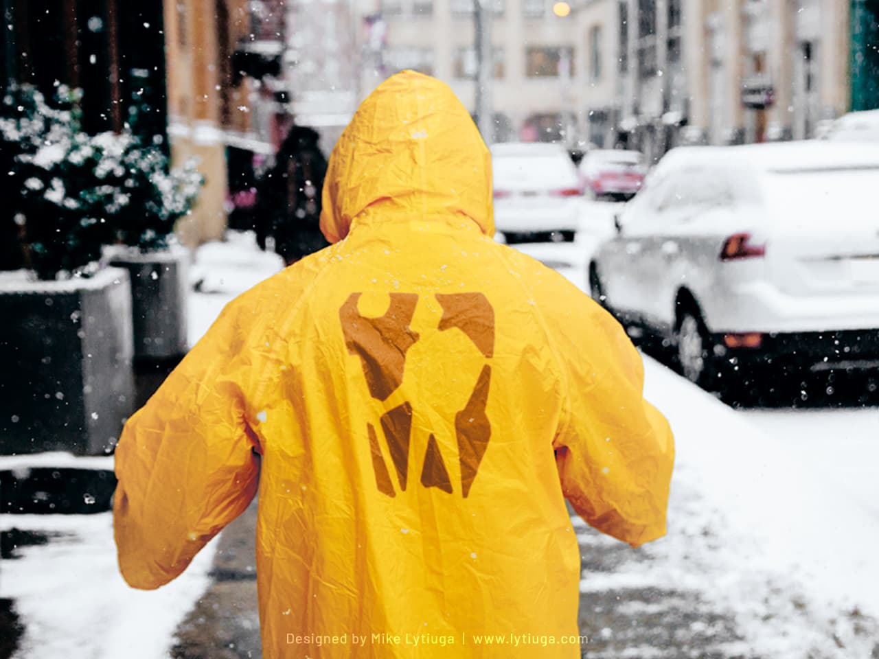
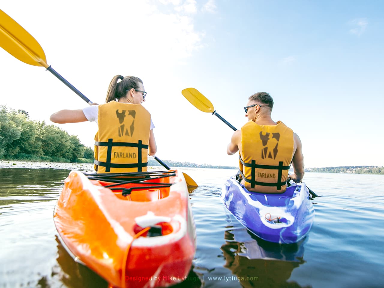
It provides excellent brand recognition, like on this yellow raincoat from the “Farlander starter pack.”
It is not done in the name of the design. The bright yellow jacket with a huge contrast logo helps recognize teammates in crowded tourist places, like Chichen-Itza. Also, it keeps people from getting lost in foggy weather conditions.
CUSTOM LETTERING
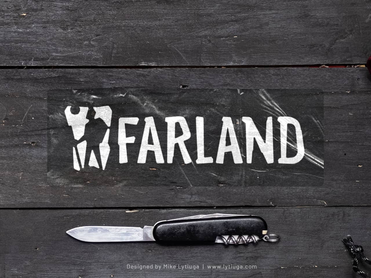
Many famous brands used ordinary fonts for the brand name, but in this case, I’ve decided to create a custom lettering where each letter’s graphemes echoed the icon. Just to emphasize the brand’s uniqueness.
And the lettering keeps readability well, look at this car window sticker!
Monochrome logo
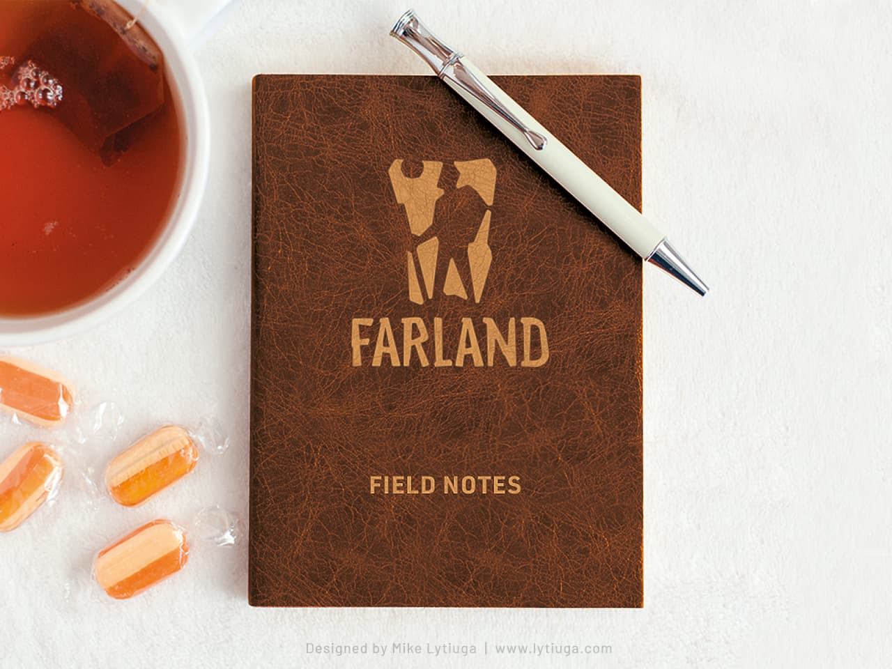
In the life of any brand, there are everyday situations when a logo should be applied in one color only for the sake of budget-saving or due to the inability to use paint or a specialized application method, such as laser engraving.
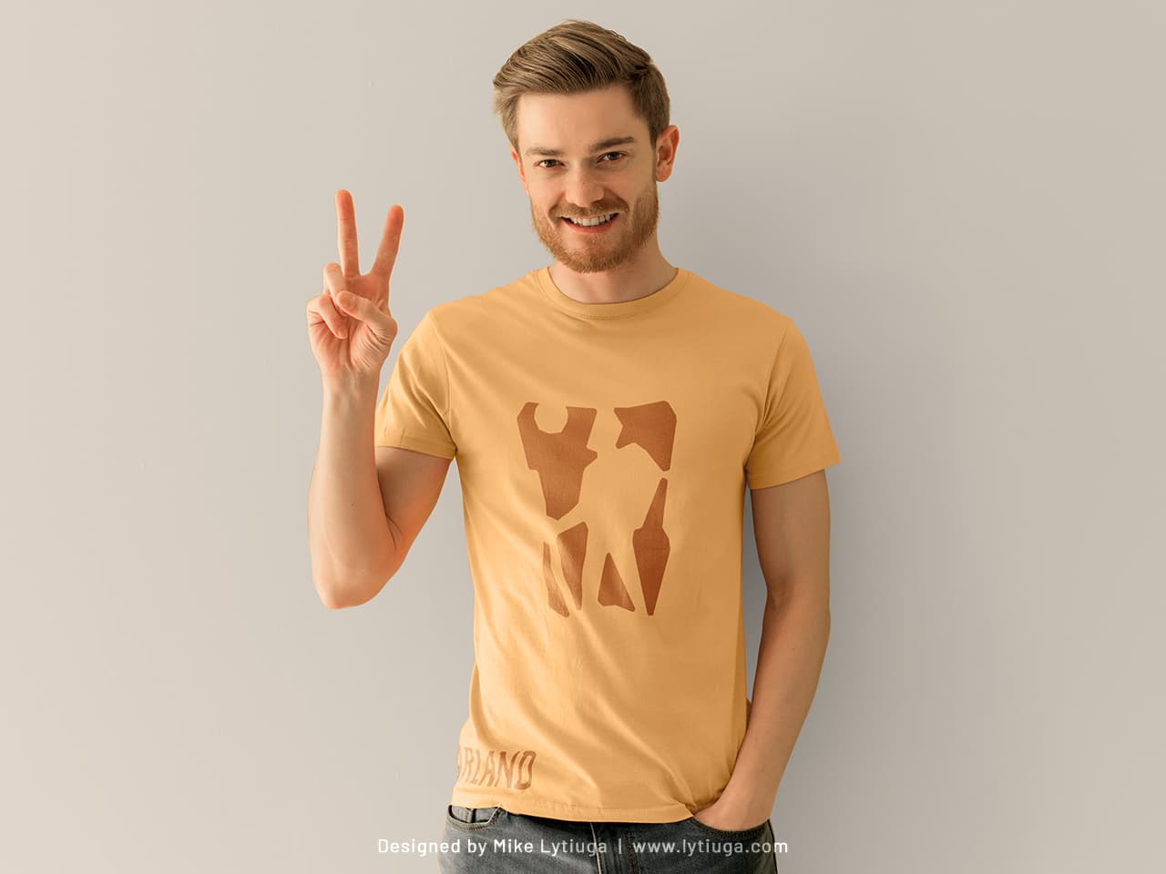
And don’t forget about branded merch!
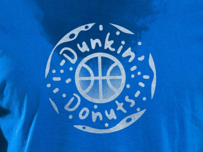
Nice t-shirt, isn’t it? One-color screenprinting, two imprint zones, and water-based ink to avoid the sweet spot of the full chest imprint. Simple but nice-looking merch.
CREATIVE TEAM
Art director, logo designer, and lettering artist: Mike Lytiuga
DID YOU LIKE THIS LOGOTYPE?
Do you have any questions about your existing logo? Does your business need a new smart logo design or redesign of the old one?
Just drop me a message by filling out the form below, and I will help you.

