LOGO DESIGN: the story behind it
Seeley Lake is a small and cozy town in Missoula county, Montana. It was founded in 1881, and like many similar towns, its history and formation were associated mainly with sawmills.
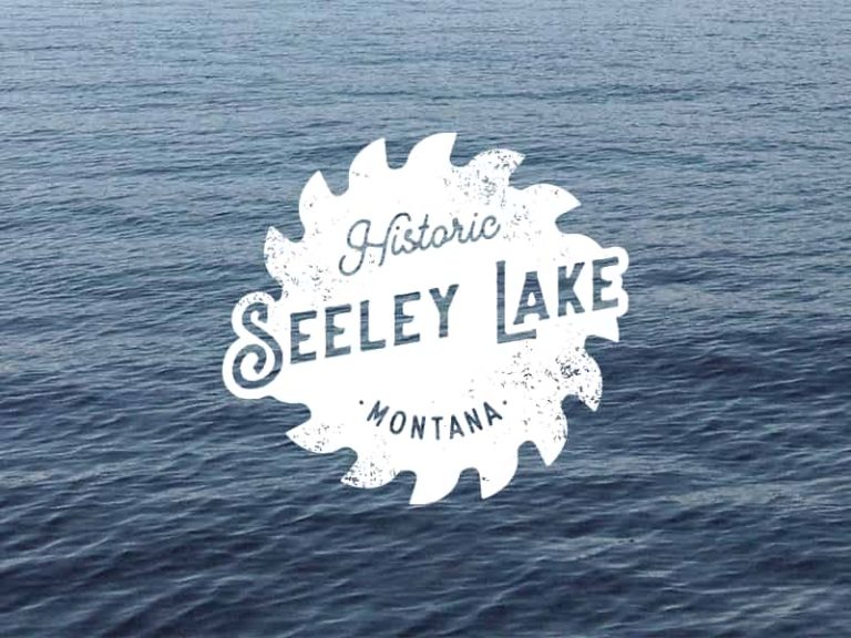
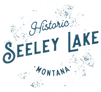
A group of people formed the local historical society trying to preserve the heritage of this place. Therefore, it is not surprising that the logo is based on the image of the blade of an antique 16-toothed circular saw.
The logo preserves and increases.
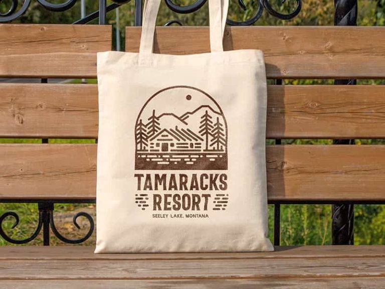
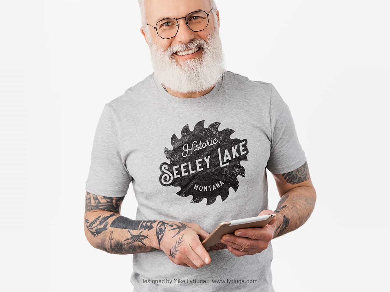
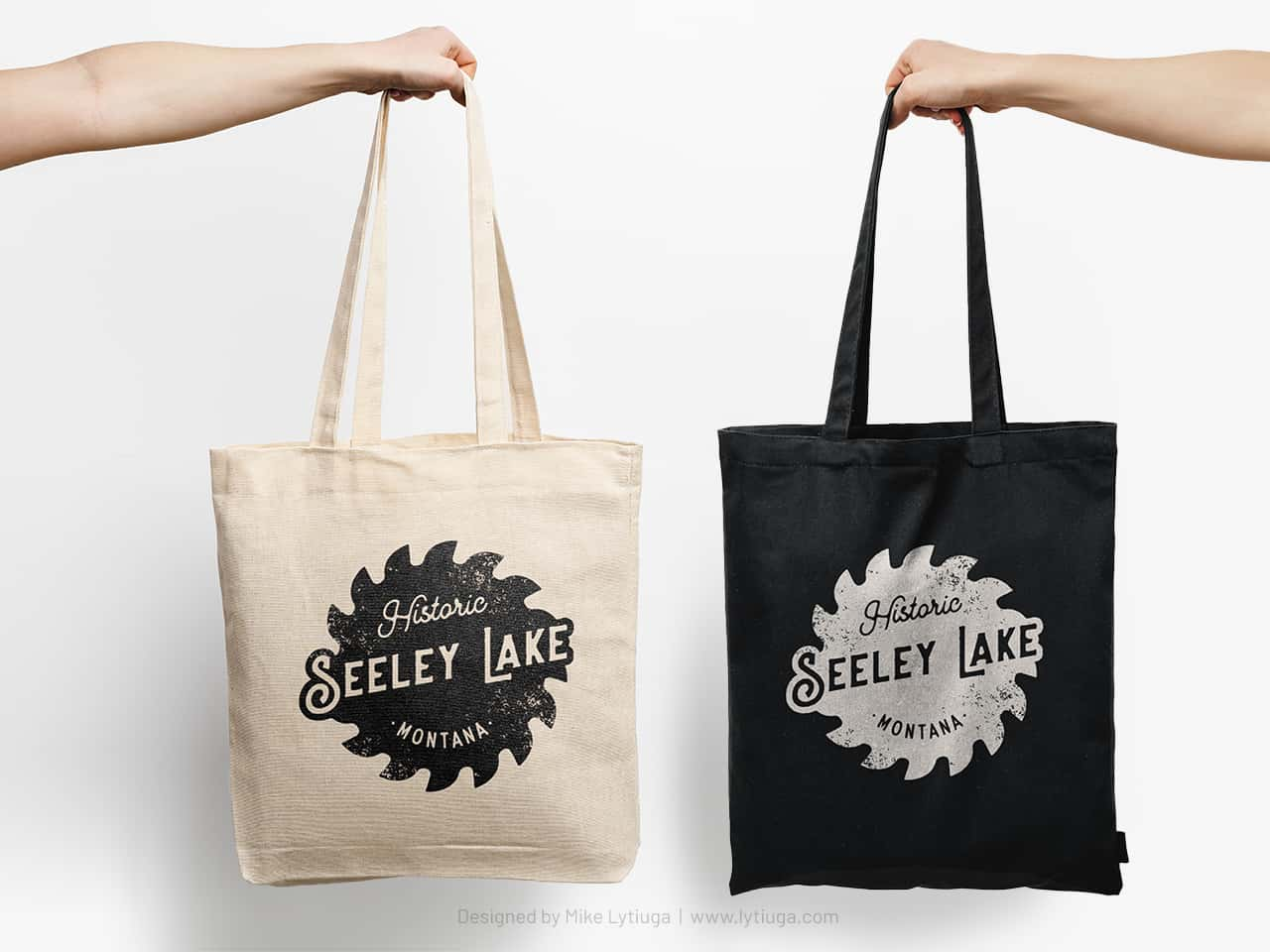
Groups like this usually don’t have big promotional budgets and often try to raise money for their initiatives. Understanding this, I designed the logo to look great when printed in one color.
This logo really saves and increases: keeping the budget through cheaper printing and growing revenue by looking hip on branded products.
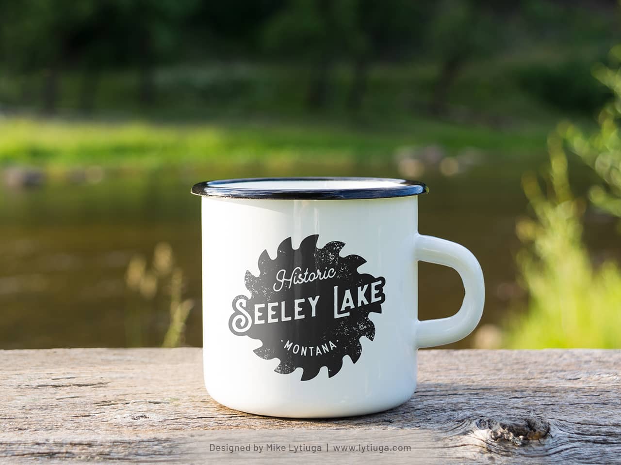
You definitely need a mug like this if you’re chilling at a campground in Montana.
CREATIVE TEAM
Art director and logo designer: Mike Lytiuga
DID YOU LIKE THIS LOGOTYPE?
Do you have any questions about your existing logo? Does your business need a new smart logo design or redesign of the old one?
Just drop me a message by filling out the form below, and I will help you.


