LOGO DESIGN SOLUTION
A juicy orange slice, a vibrant color, and spinning disco lights are united to create a modern and simple logo design.
The icon graphic provides instant brand recognition even without the brand name text. Also, the one-color logo design made branded merchandise production significantly less expensive.
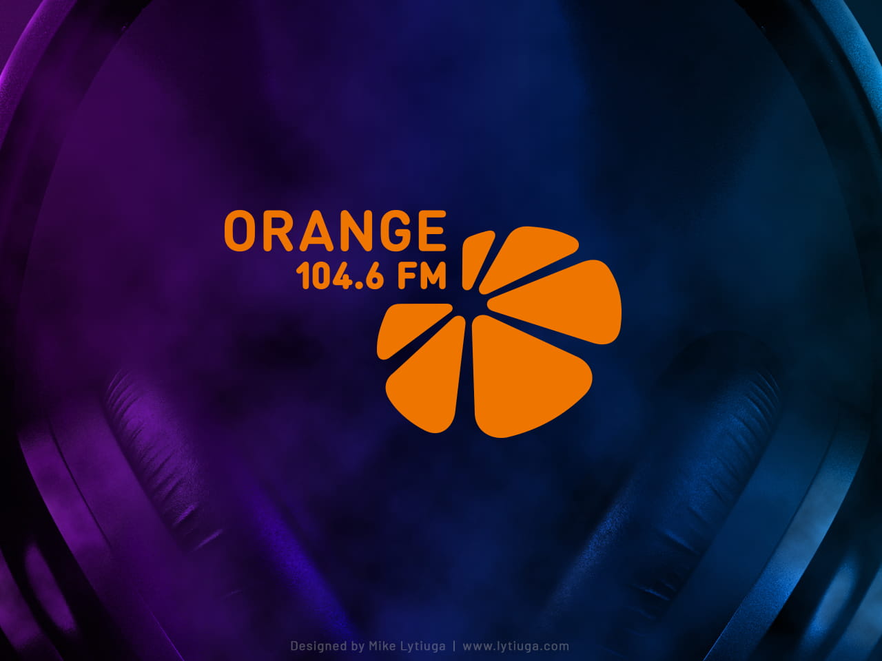
The horizontal logo option with primary brand color.
This is a primary logo option for major marketing communications, like collaterals, corporate identity items, sponsorship events, etc.
Why does the logo layout look a bit strange? I purposely created strange logo proportions to beat the others logos used in sponsorship campaigns.
How does this trick work? In sponsorship events where many sponsors’ logos are placed in one line, and each logo has the same equal space — the Orange 104.6 FM icon looks much bigger and more noticeable than the logos of neighboring competitors.
Vertical logo
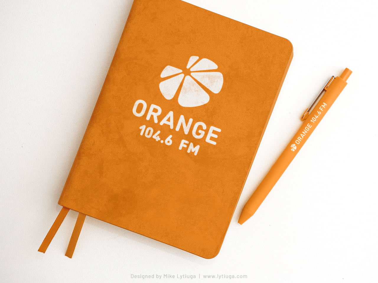
This logo option is mainly used for employees’ branded goods with a vertical layout, like notepads, tumblers, headphones cases, etc.
You can also see the one-string logo layout just for pens (and studio drummers drumsticks) only. Due to the small imprint zone height – the brand name takes on the core brand awareness function.
INVERTED MONOCHROME LOGO
This logo option is primarily used for various station one-color printed posters. As you can see – the logo keeps excellent brand recognition.
SHORTENED LOGO OPTION
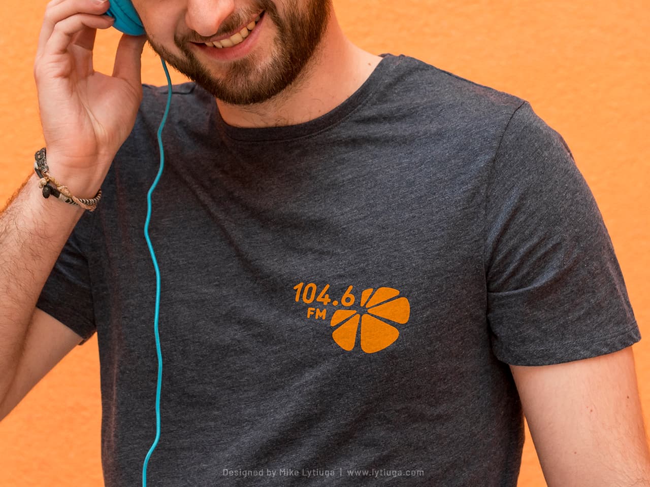
Just a radio frequency with the icon – and actually, this all that you need to identify yourself on event backstage. This logo option is used for marking various studio sound equipment and for employee’s everyday working apparel.
Make my logo bigger!
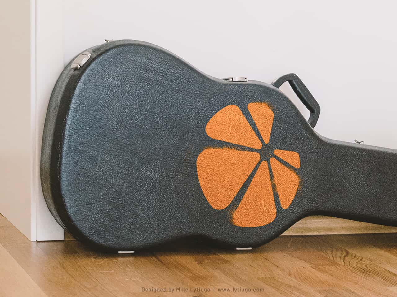
Every graphic designer has ever faced such a requirement at least once, and sometimes you can’t avoid requests like that. But look, how good this studio musician case is! Just a tiny hand-maid example of logo realization: a stencil and one layer of blowing with spray paint.
The clean graphics of the logo allows us to make a stencil without distorting the logo shape with stencil jumpers.
WE WANT MORE LOGOS!
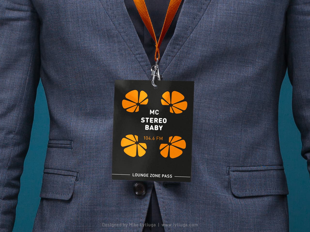
Ok, what the client wants, the client wants, right? But even then, the logo design can create a beautiful composition – look at this pass for the station’s DJ’s dance party!
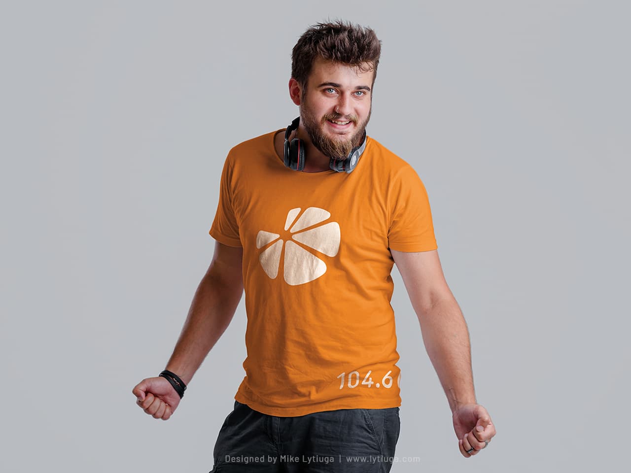
Don’t forget about branded merch!
Brand fans, supporters, sponsors, and influencers always need stuff like this. Cute scoop-neck orange t-shirt with one-color screen printing on it – look fantastic and have reasonable production cost.
After a while, the logo became so recognizable that most branded merch could use just an icon without frequency designation.
But I still recommended placing the frequency somewhere.
Why isn’t the branded t-shirt white with an orange imprint? The answer is simple: the brand orange color with a white logo produced a much noticeable brand look in the street crowd.
CREATIVE TEAM
Art director & logo designer: Mike Lytiuga
DID YOU LIKE THIS LOGOTYPE?
Do you have any questions about your existing logo? Does your business need a new intelligent logo design or redesign of the old one?
Just drop me a message by filling out the form below, and I will help you.

