LOGO DESIGN STRATEGY: simplicity is the key
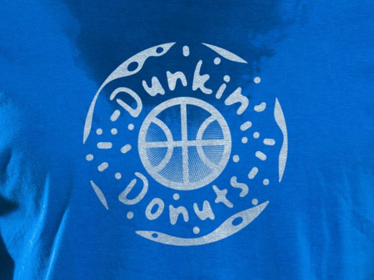
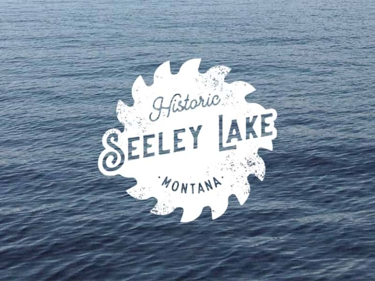
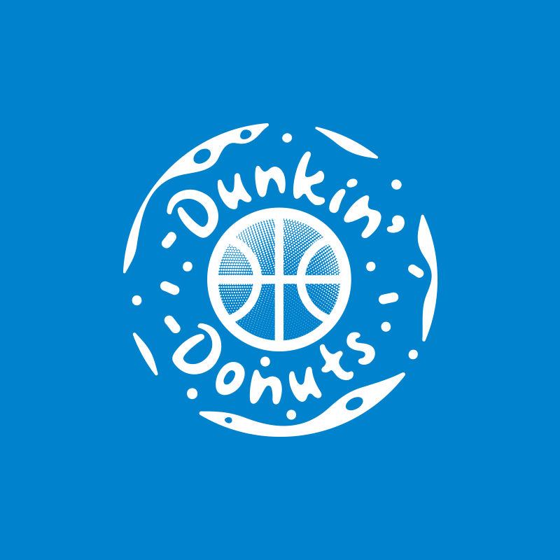
The idea behind this logo is so obvious, so no sense to explain. It’s just a neat mix of meanings expressed in clear graphics, plus a fun, informal font, instead of the boring college-type fonts.
For brand color spectrum, I’ve chosen two Pantone colors that each screen printing shop usually has in stock; we remember, the budget is tight, right?
True minimalistic branding
This brand doesn’t need a brand book; it doesn’t need primary and secondary brands, vertical and horizontal logo options, etc.
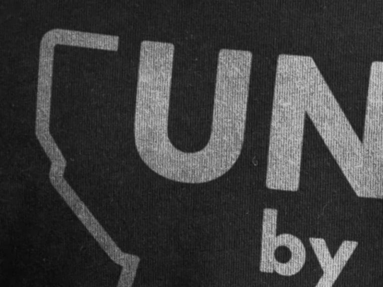
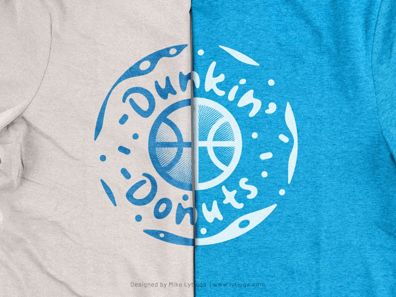
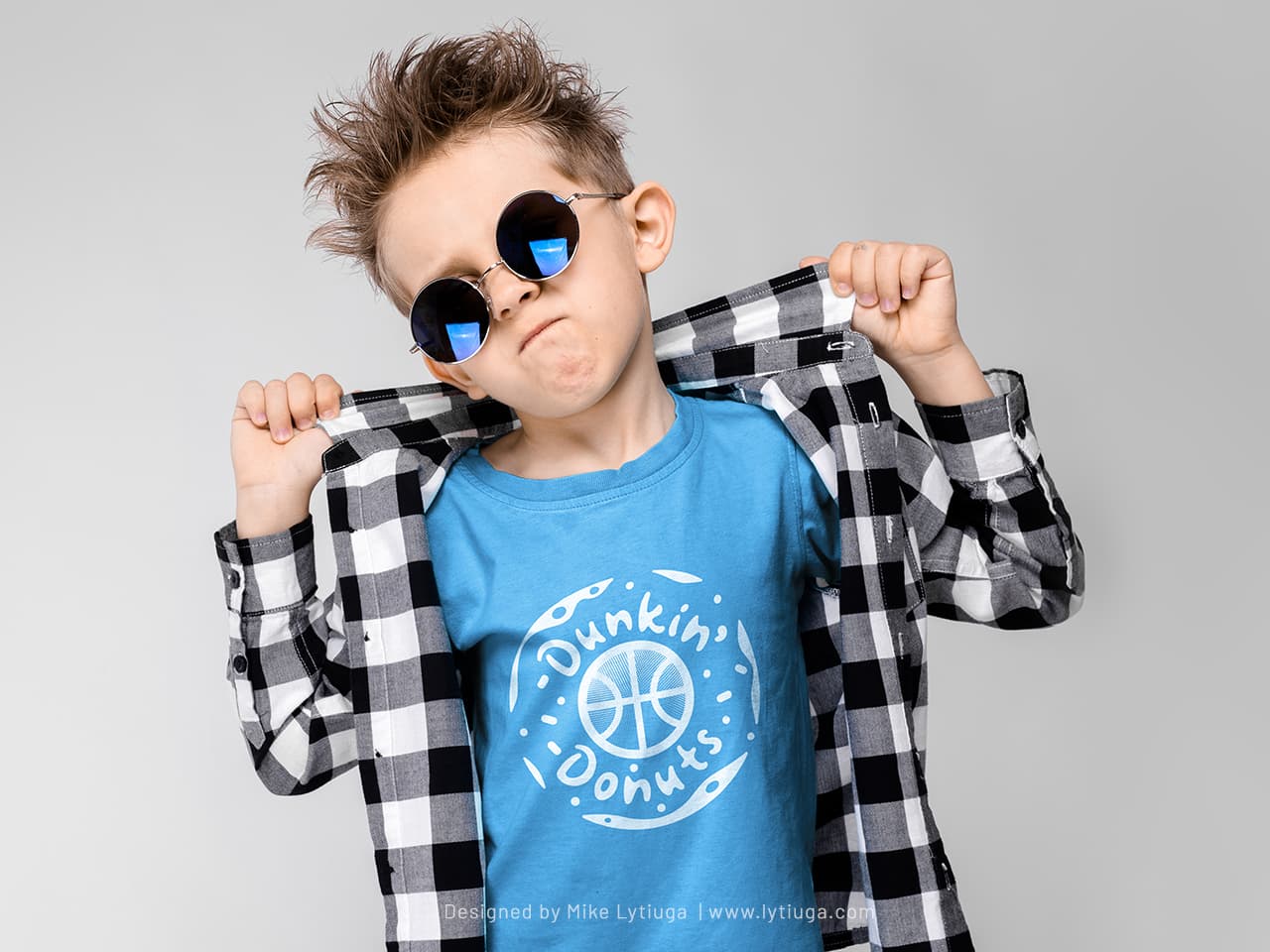
There are only two versions of the logo to cover all branding needs: the first for printing in white on dark apparel and the second for printing in dark colors over light-colored clothing. What is the difference? – take a closer look at the picture.
The primary branding color is white; the logo is designed for quick, cost-effective, one-hit screenprinting.
Single-color coolness
This is what a typical player’s jersey looks like: a plain cotton t-shirt with a large logo on the chest, silk-screened in one color and the player’s number and last name on the back, added with a thermo-transfer.
Dang ol’ black
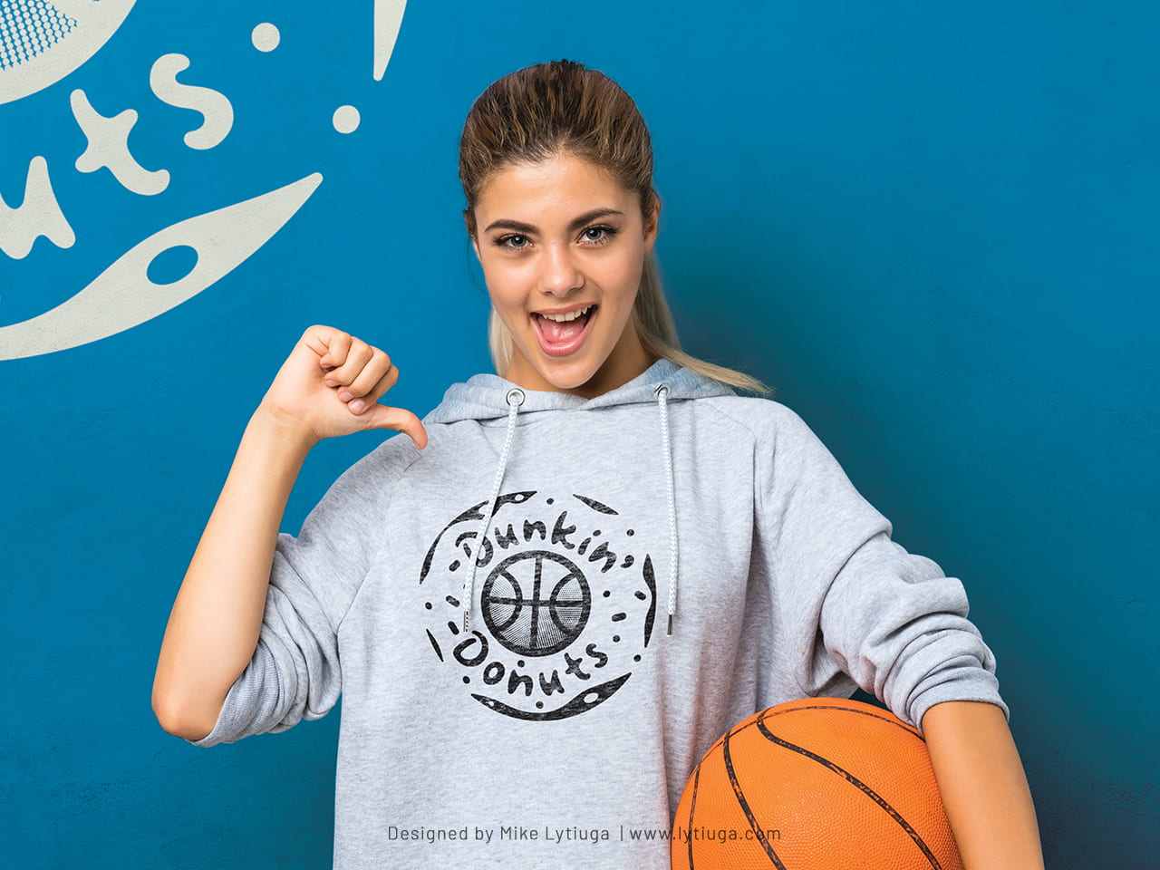
There are some situations when you can’t use color, like some light grey heather-colored apparel that athletes like, but blue imprints look not so cool.
Dang ol’ black, man, it always fix this. As we can see, the logo is well recognizable and legible.
Fans going crazy
When your favorite team wins, when there is something to shout about, something to drink, and of course, what to wear and what to wave in support.
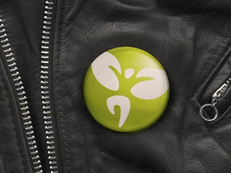
The team’s merch uses white basics: t-shirts, bags, caps, and pin-buttons with a blue print.
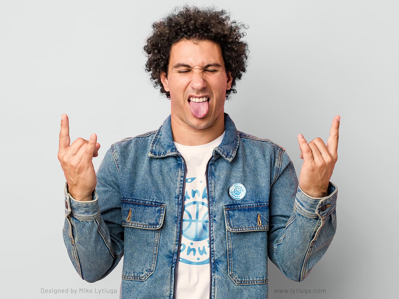
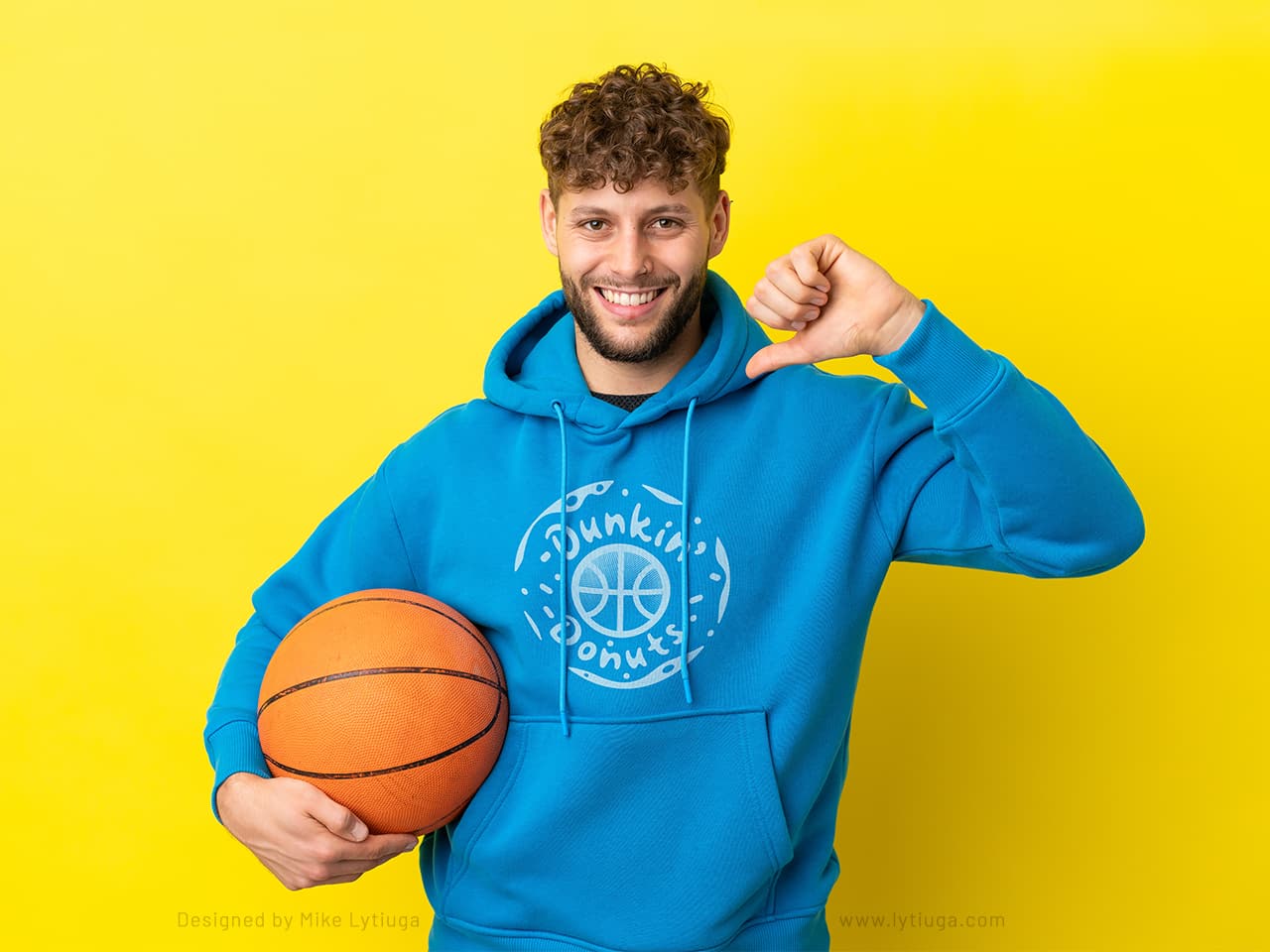
A well-done logo always produces nice-looking merch.
CREATIVE TEAM
Art director & logo designer: Mike Lytiuga
DO YOU LIKE THIS BRANDING?
Or maybe your team needs branded clothing or merchandise for fundraising? Send me a message, and I’ll help create your team branding, apparel sets, and merch guides.
And if you’re somewhere around Montana – I’ll help you with getting your shirts/mugs/bags – or whatever else you need already printed;

